Anthotypes
Hello and welcome back to my stream of consciousness “blog”. I’m still not comfortable calling this a blog without the quotes, I’ll get there someday.
Today we will be talking about anthotypes. I’m sure you’ve heard of cyanotypes, and there’s a good chance you’ve tried your hands at it. Anthotypes are very similar and work under the same general principles, it’s a style of contact printing that utilizes sunlight to bleach out parts of dyed surface using negatives/positives in order to create an image. Anthotypes differ in that they are created using plant based dyes that react to full spectrum and high UV light, unlike cyanotypes that are able to react to only UV light and use lab extracted chemicals. Cyanotypes are more consistent, quicker to expose, and can work using artificial UV light which makes them a consistent practice in contact printing. Anthotypes have a lot more variables to control and require long exposures in direct full sunlight, making it harder to whip up whenever the mood strikes. I think it’s theoretically possible to create an exposure box using artificial full spectrum and high intensity lights for creating anthotypes, but I haven’t yet tried this and my experiments on using just UV light had no effect on the plant based dye.
This process of a contact print relies on controlled photodegradation, or the process that causes color to bleach over time due to exposure to sunlight. Everything that we see that has a color, has that color because of its chemical composition giving it a specific molecular structure that will absorb all other wavelengths of light other than the one which is reflected back, absorbed by our eyes, and registered by the brain as said color. Photodegradation is when consistent light exposure, or more specifically the excited photons that make up that light, causes those molecular structures to break down enough for the color to start disappearing. Laser tattoo removal works under the same principle, except in that case the laser is doing the photodegradation.
The last little step, which is kind of optional, is a final toning of the pigment on the paper. In both anthotypes and cyanotypes, an acidic or basic bath of the print after the contact print is complete will give the color a deeper or lighter tone depending on the pH of the toning bath. I have been consistently using a borax-water (alkaline) solution that I think does really well as it can deepen and shift color towards the warmer wavelengths. I’ve tried various forms of acid but that has less of a noticeable affect and mostly works to preserve the natural extracted pigment without toning. I think temperature has an effect on the eventual color of an anthotype print, but I haven’t yet experimented on this yet and will probably write a separate piece on the various experiments of toning I’ve done.
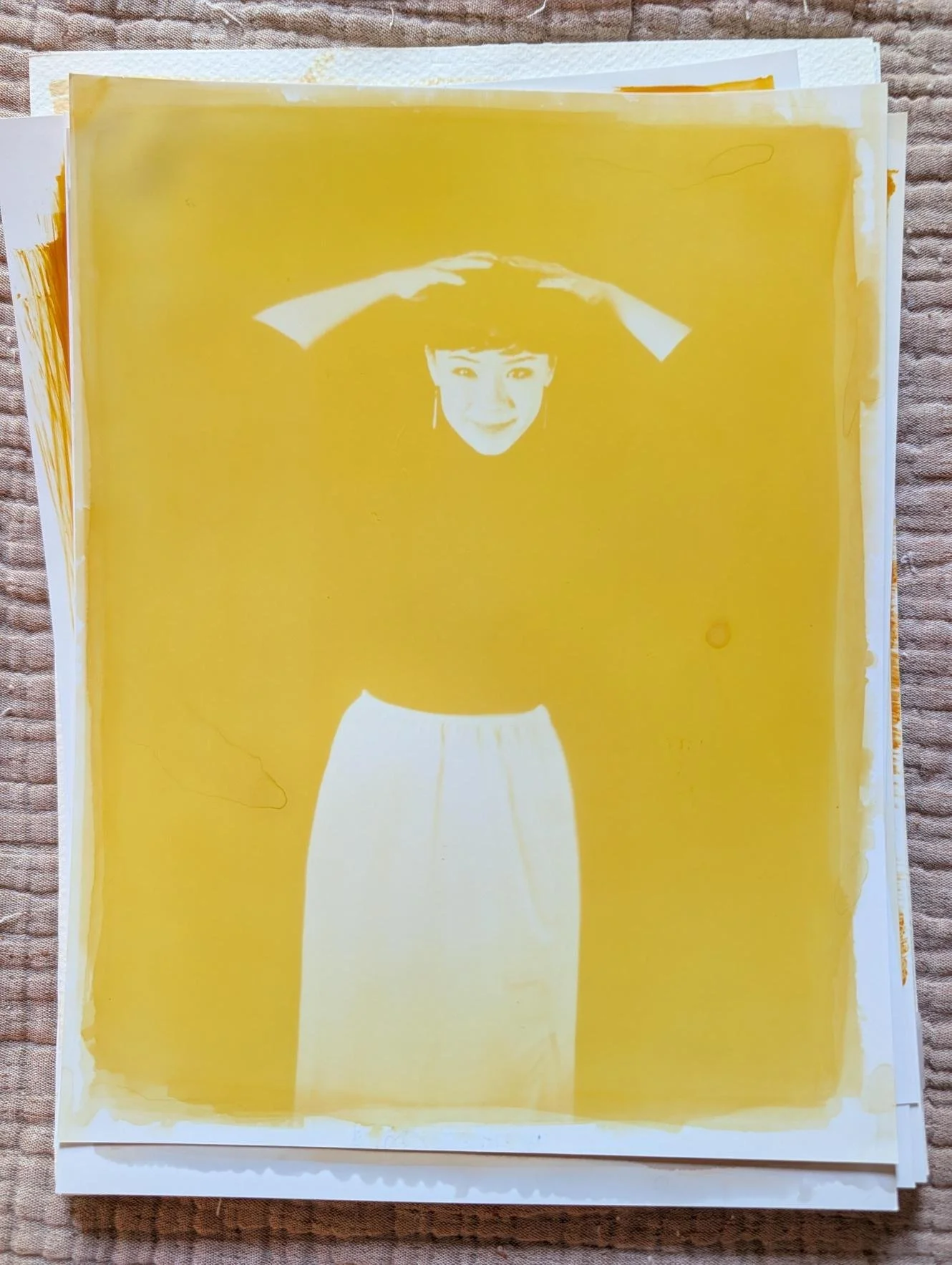
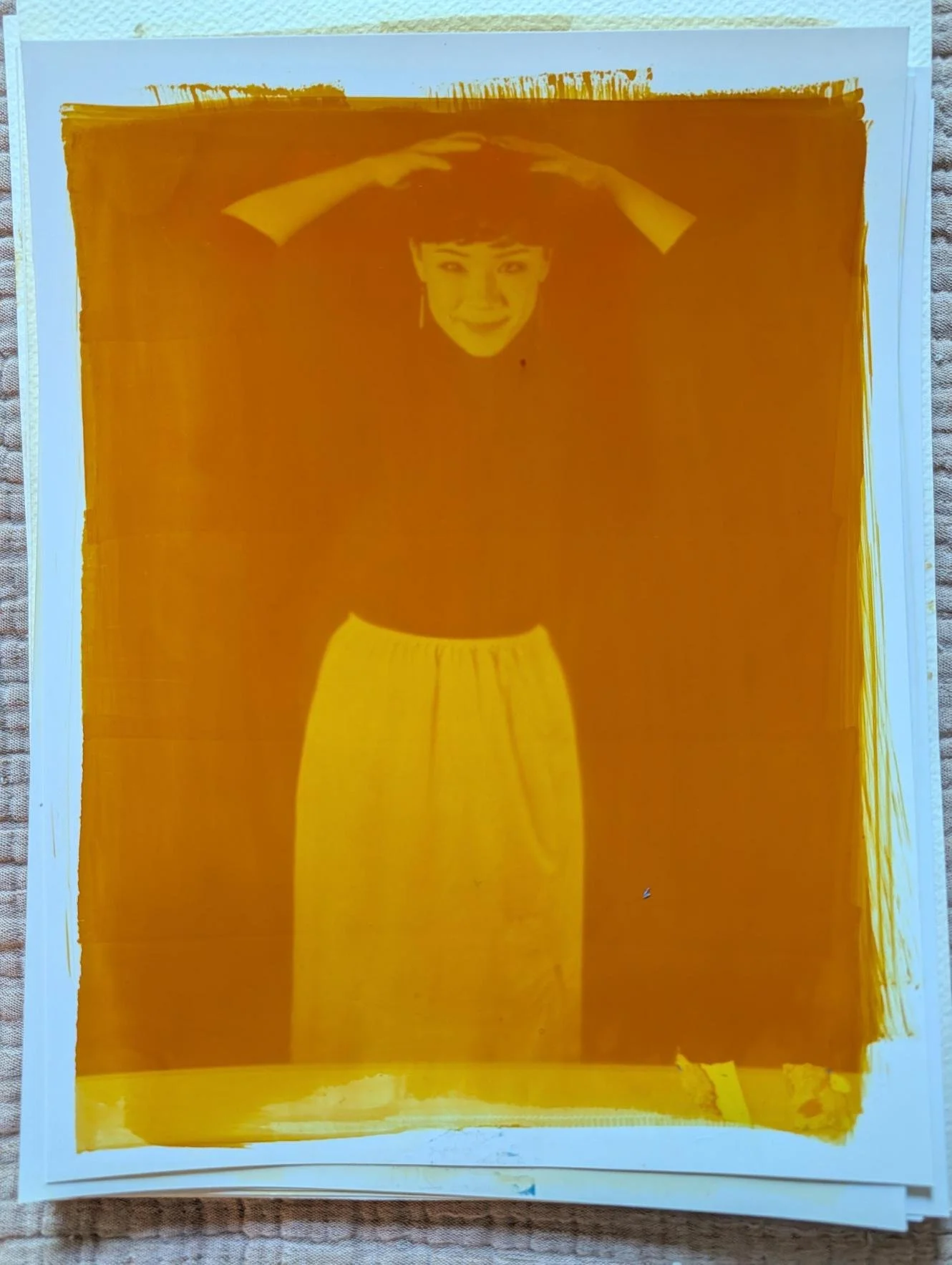
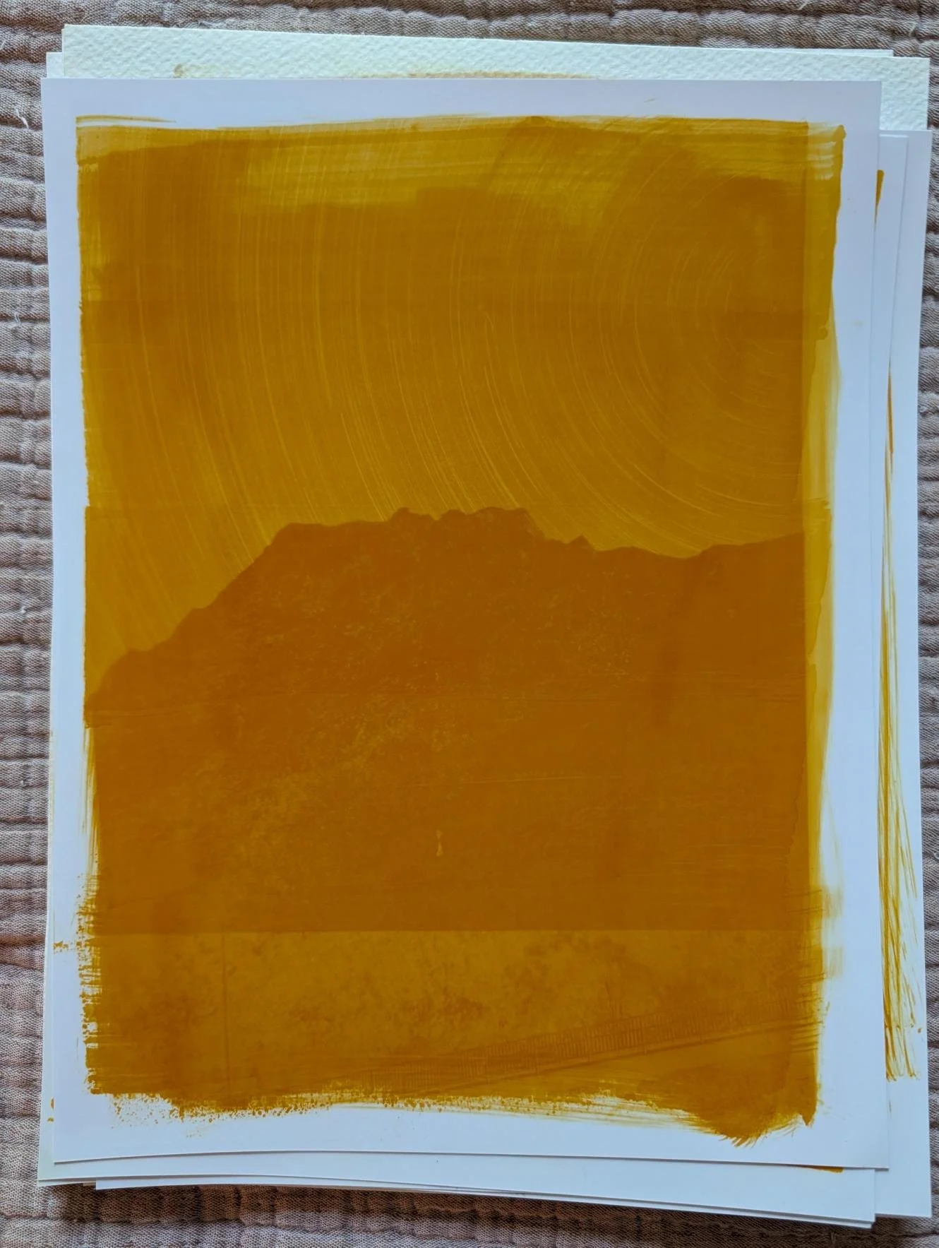
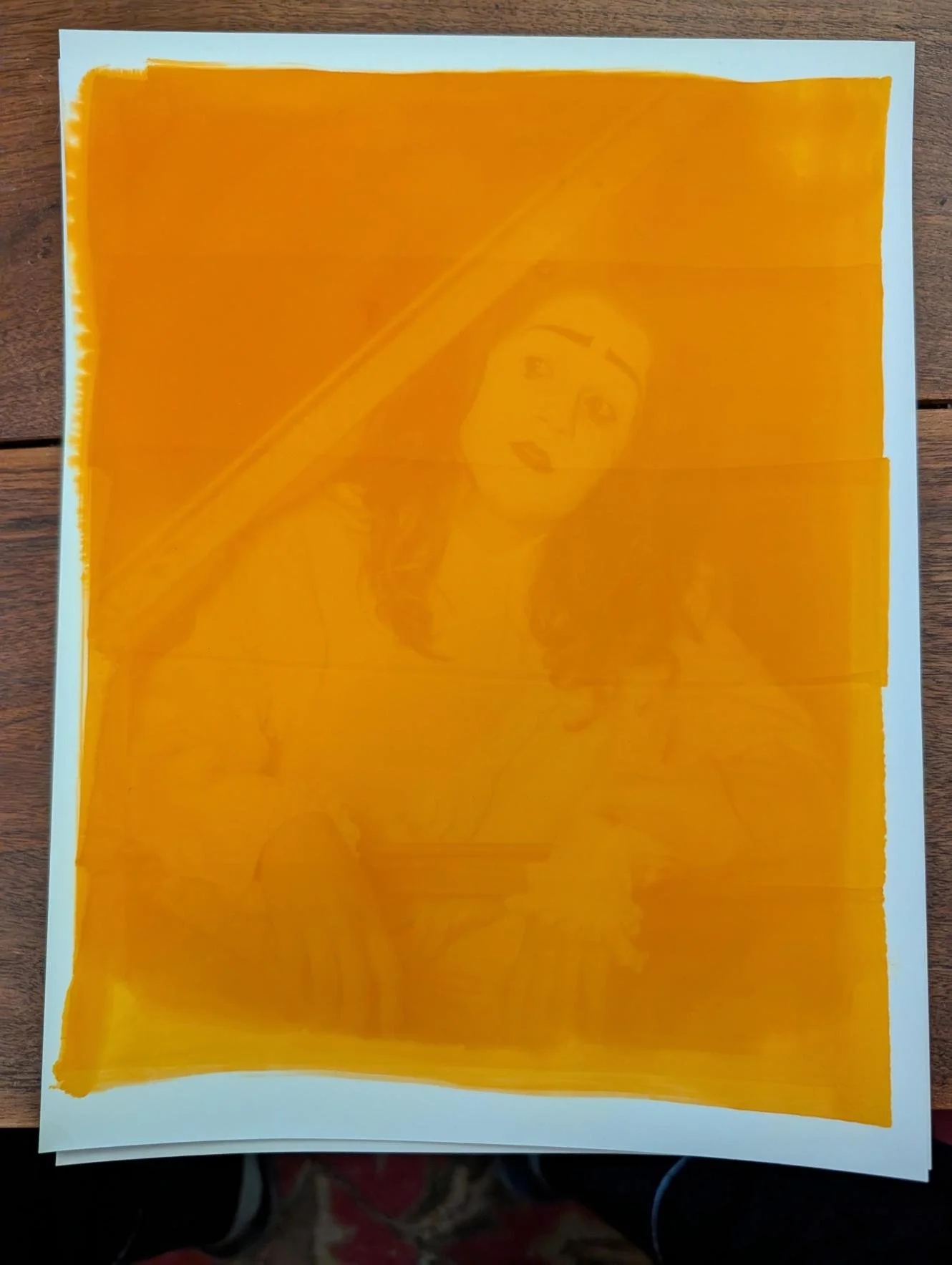
In the case of anthotypes, the plant based dyes rely on naturally occurring color pigments to be extracted the painted onto a surface, covered with a positive or a negative and left in direct strong sunlight until the image is formed. The amount of sunlight time varies, but it can be from a couple hours to up to a week depending on the dye and intensity of the sun exposure. The first kind of anthotype I experimented with, mostly because of how easy it was to extract the pigment, was turmeric based. I had a small jar of expired turmeric in my spice drawer and I mixed that turmeric powder with ~70% isopropyl alcohol and poured the mixture through a coffee filter to extract the chemical responsible for the yellow-orange pigment, curcumin. Then, using a foam brush, I paint this alcohol extracted pigment onto various kinds of paper. This was the hardest part of the entire process, using a thick paper that won’t immediately get soaked through with the alcohol is very important and being able to paint on the pigment without leaving obvious paint strokes was very difficult. I used regular paper, thicker construction paper, water color paper, and luster photo paper. Out of all those, the photo paper and the water color paper were the most effective, however the clear winner was the luster photo paper (go figure, it’s also the most expensive). The luster finish on the paper doesn’t immediately absorb the ink, and lets you spread it all over the surface of the paper evenly before it dries. The color also doesn’t saturate to the other side whatsoever, and the paper is very good at holding itself together even when completely drenched in the borax-water solution for final toning. In fact, once it dries, it’s almost as if it was never wet to begin with.
Like everything else I’ve ever attempted, I began with a series of botched results. Regular printer paper is not the way to go, the dye soaks everything and then once you try to tone it in borax, the unexposed dye on the backside of the paper will overrule any image on the front making it a solid yellow-red color. Bad bad bad. Watercolor paper or thicker construction paper got me closer, however the streaking of the brush, inconsistent saturation of the dye on the paper, and lack of clear details made it still not ideal. Which is weird because all over the internet I saw people swearing by watercolor paper, which I found to be just okay. Maybe because they’re not making full detail images, they’re just pressing flowers and leaves between the paper and glass. Anyway, my best results came with using luster photo paper, which is ridiculously expensive. I’m going to try other kinds of cheaper photo paper but for right now that’s what I had on hand so that’s what I’ve been using.
The second thing to get right was the exposure times. Too much exposure will wash out your image and too little exposure won’t let the image really form at all. This I did the least amount of effort in trying to track, I would set up my negative and my dye-laden paper outside on the roof of my car and let the sun beat down for hours while I worked from home. In general, 4-5 hours of exposure is enough, however the variables are ever-changing. The UV intensity, cloud cover, the dye used, the layers of dye applied etcetera. I used some larger frames that I had laying around that I could pull the print out from and replace with the negative and anthotype paper, left it outside, then would periodically check to see if the color in the exposed sections looked sun-bleached enough. Not very scientific on this one, sorry.
That’s pretty much all there is to it, beyond the basic concepts everything can be experimented and played around with. After successful experiments with turmeric, I also created dyes using avocados, dandelions, roses, spinach, and kale. Some of them are pretty good, some are just okay, the density of the color pigment depends a lot on the extraction method, which I plan on messing around with a bit more in the future. There are some of my example images below that I’m pretty happy with, I’m excited to scale this in different ways to incorporate into my main style of photography.